THE METHOD
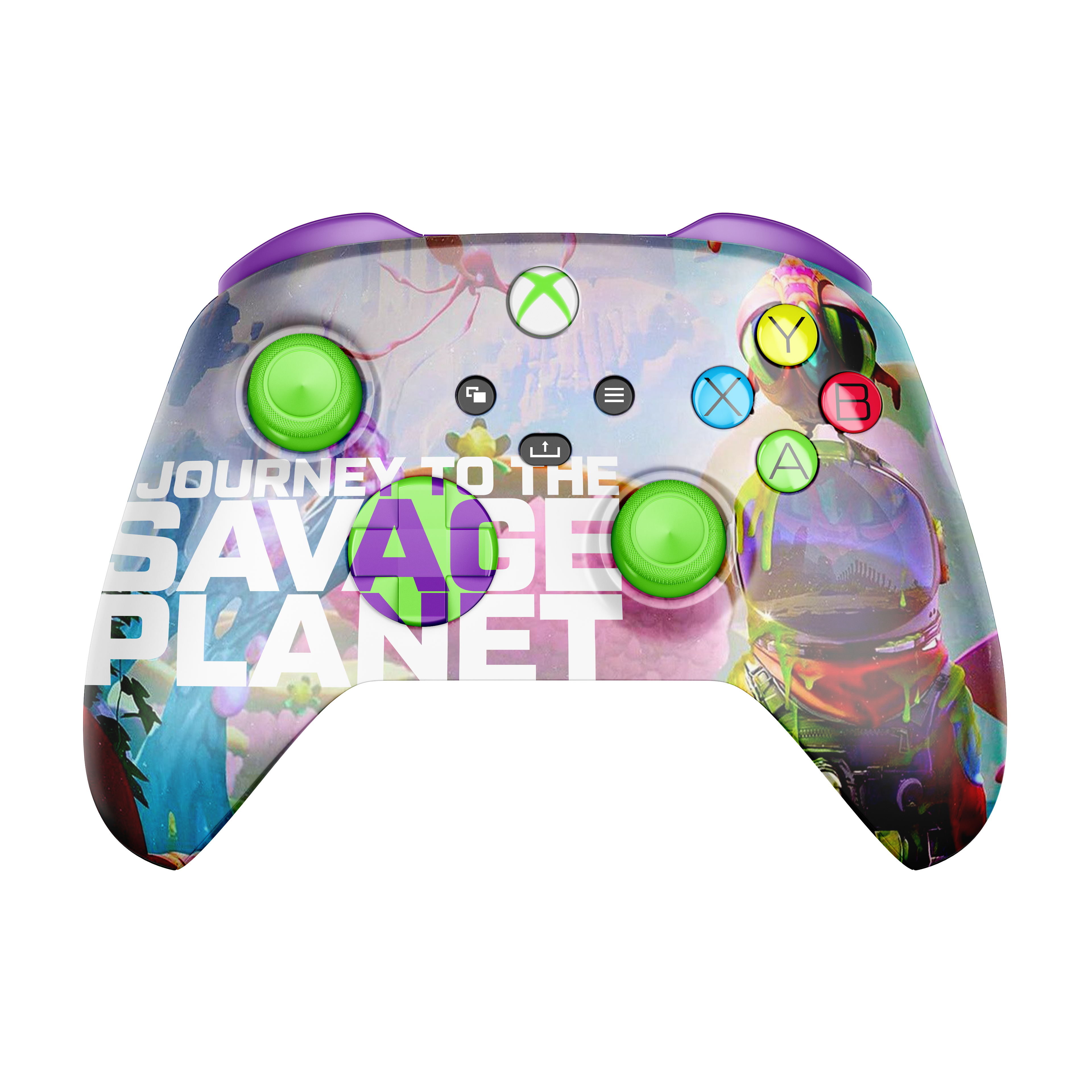
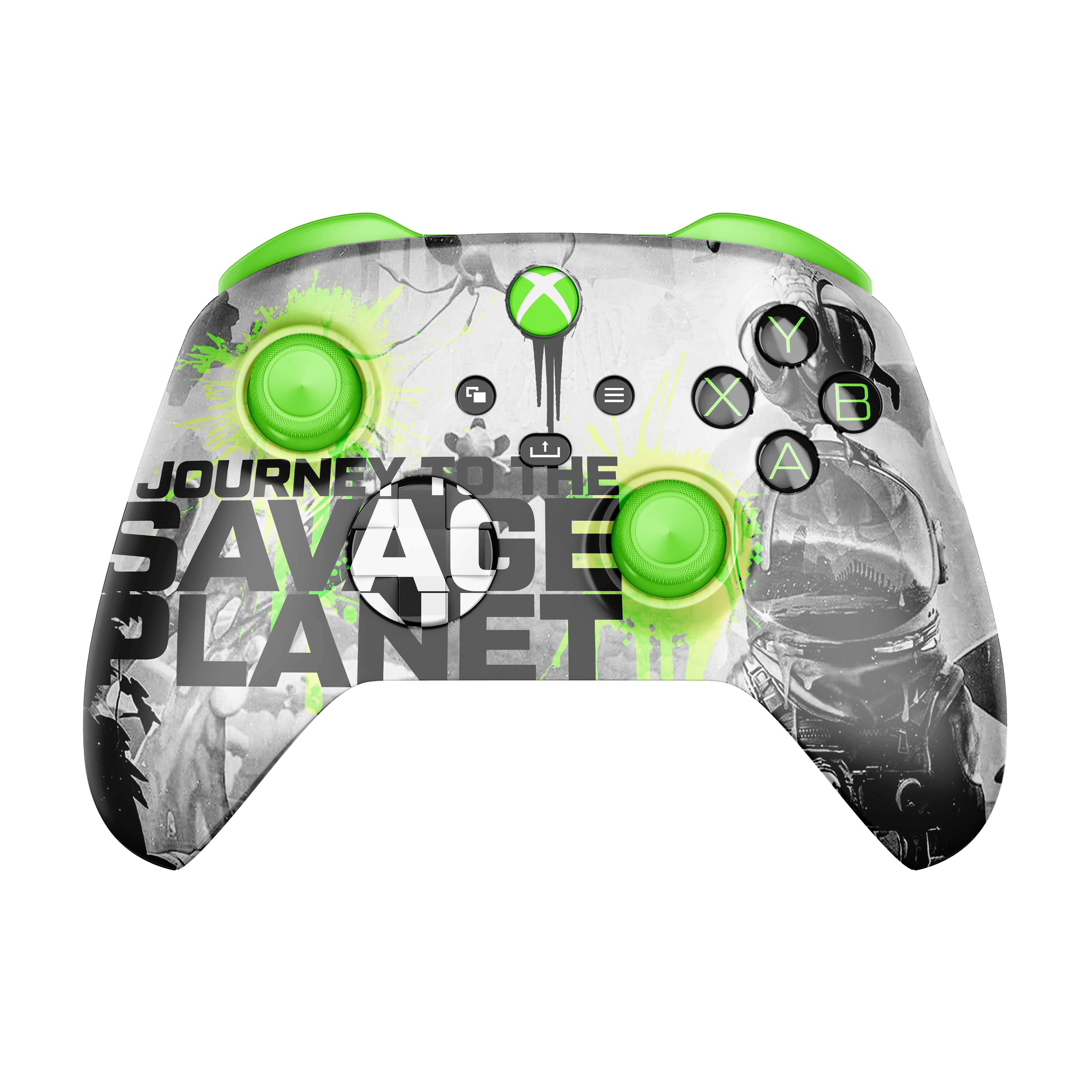
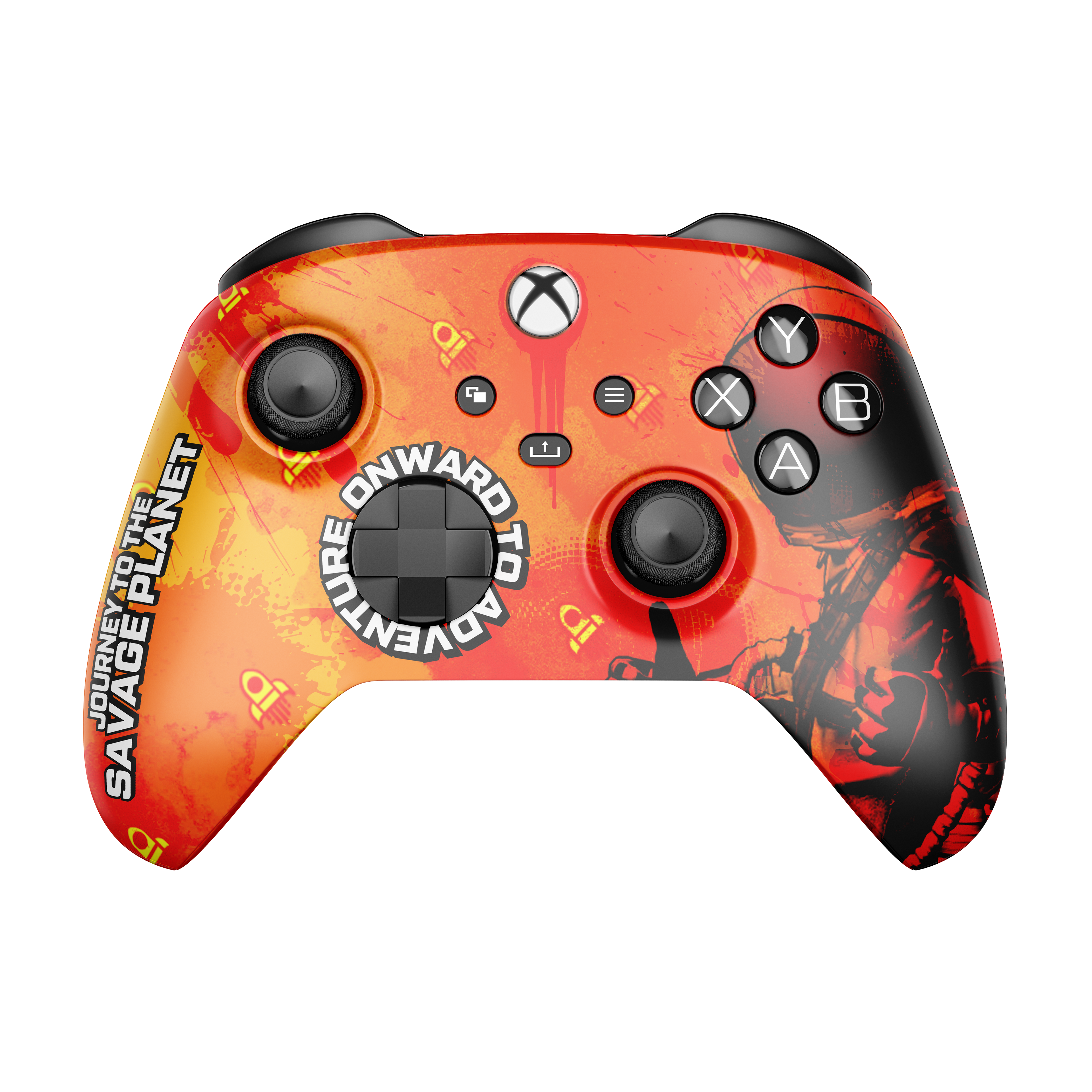
I realized that i haven't done any other packaging designs besides beer labels lately, so I thought I might do a few Xbox One X Controllers mockups for a
game that I'm really loving lately,
JOURNEY TO THE SAVAGE PLANET
game that I'm really loving lately,
JOURNEY TO THE SAVAGE PLANET
Yes, I know they are completely ridiculous, but honestly, I think that's why I love them so much!
And then I thought, let's give them a Star Wars Squadron feel, since it is after all an
outer space game
outer space game
I tried several variations of the the name in different know logo styles. The font family they used for the game, Tactic-Sans, is a really fun and versatile font!
I will probably use it more.
I will probably use it more.
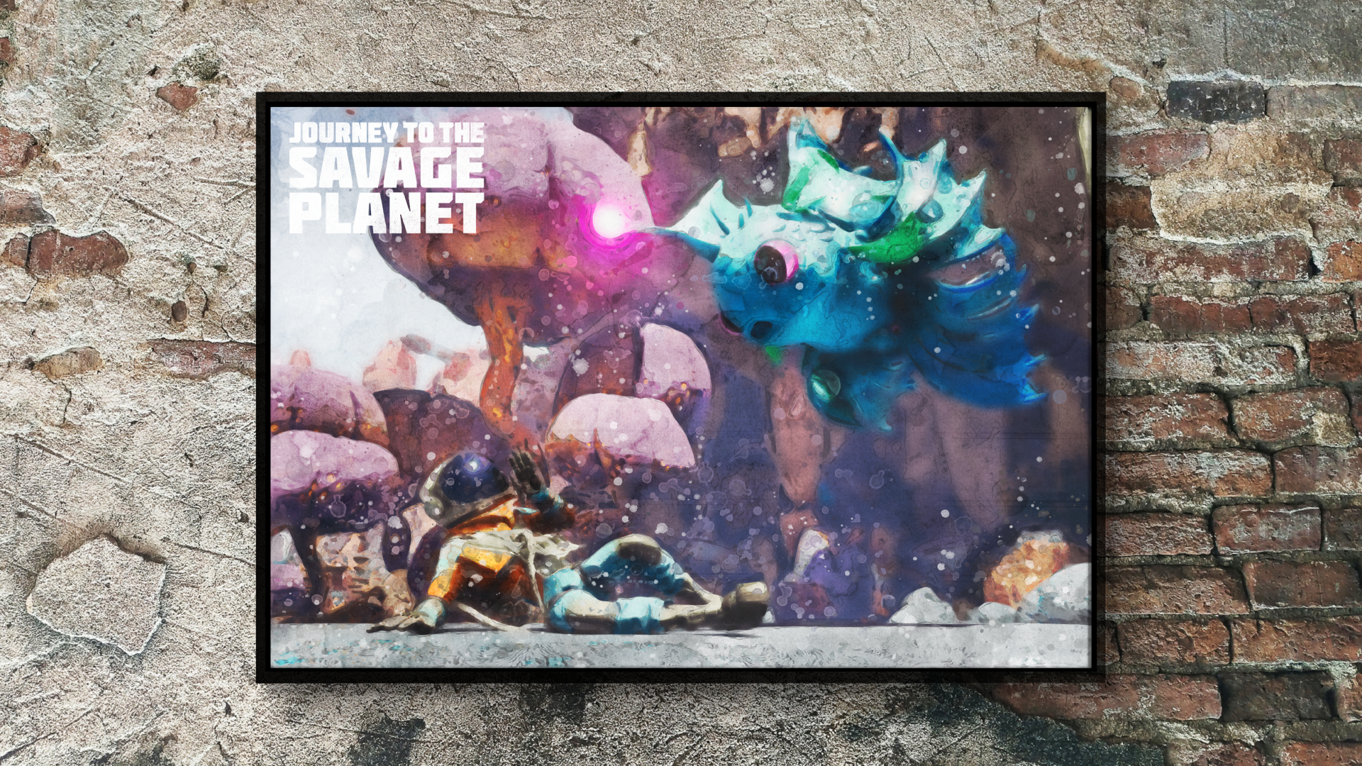
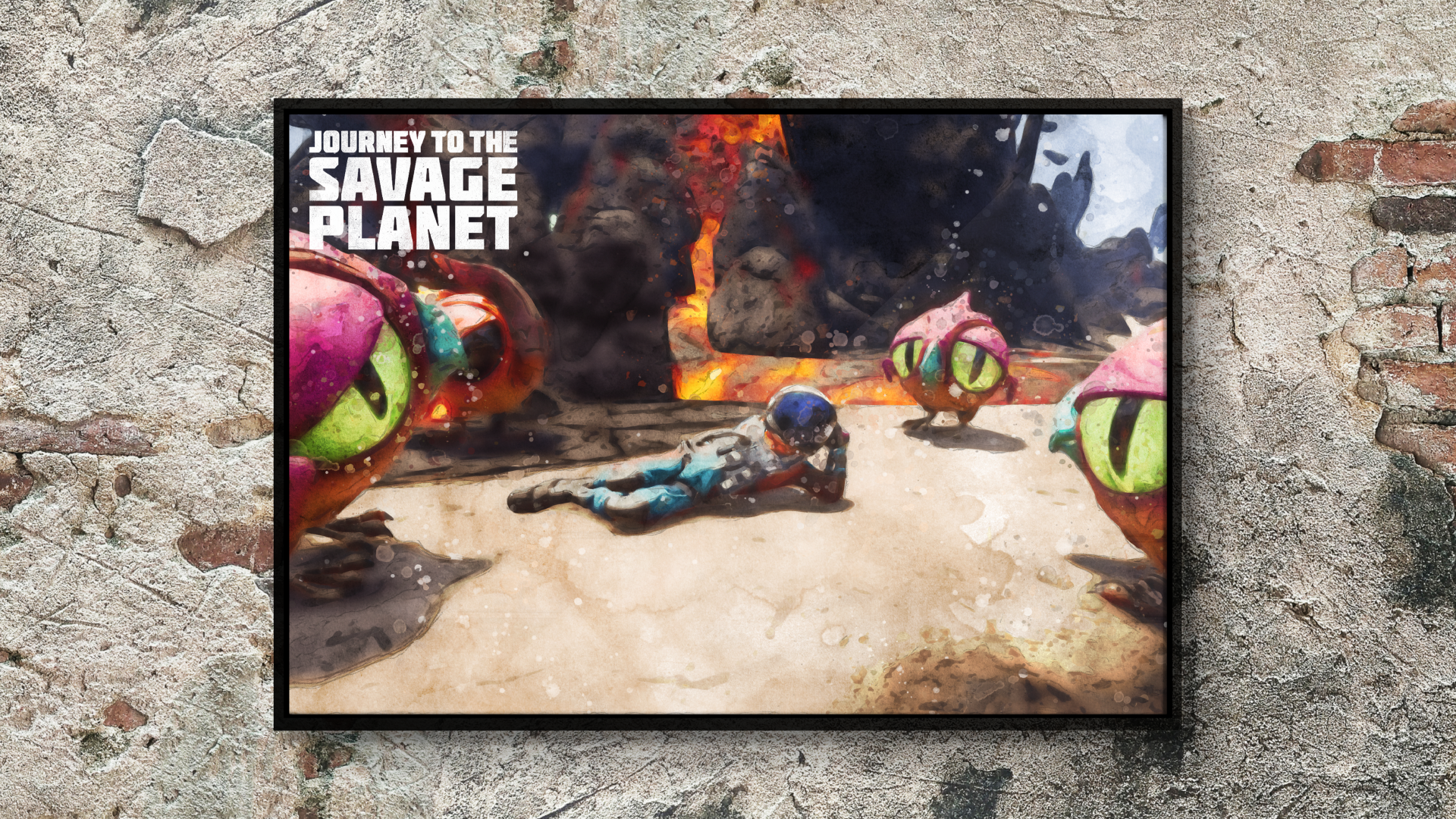
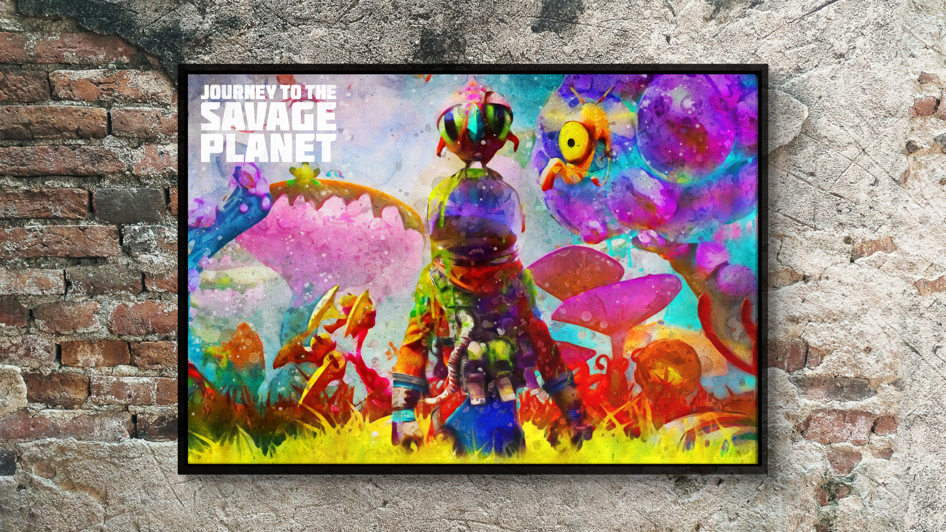
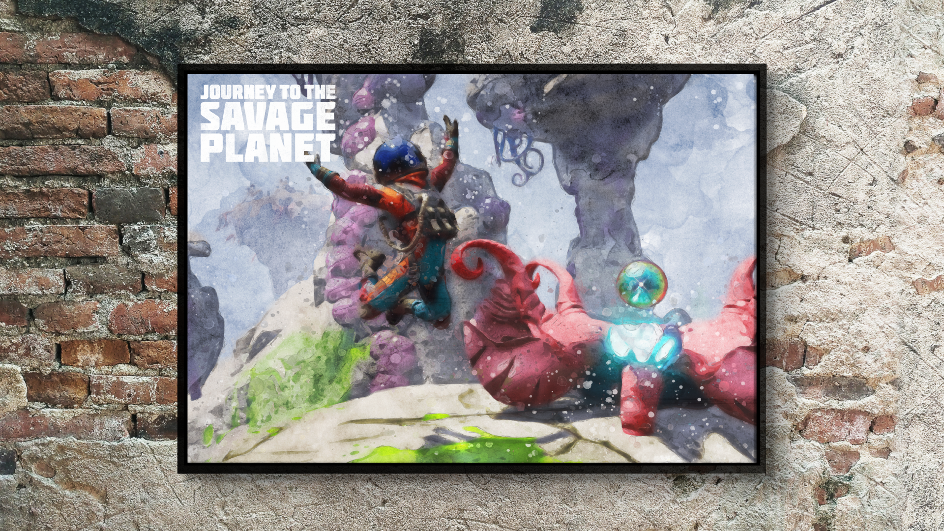
I really enjoyed creating the "watercolor" effect for the different design elements. I thought it fit well into the games rather "rebellious" and edgy art style.
Of course the controllers are the main focal point, but the art is a nice touch as well. I tried really hard to incorporate as much of the games art into the controllers and
supporting art as i could.
supporting art as i could.

The following prints are the main water-color remakes that I did of the existing artwork from the game. Which was fun and a challenge all in it's own.

© 2019-2021 DO MORE. & DO MORE. MEDIA GROUP. All rights reserved.