This project started as a visceral response to Guru's current coffee packaging.
For the majority of my life, I have been a devoted coffee enthusiast. I have tried literally hundreds of types and brands of coffees and as a designer, I have worked with a handful of coffee companies on defining or redefining their brand. Guru's current brand identity is no different when it comes to every other coffee company, and that pains me. As a fan of Guru coffee, it's hard to see a producer with a quality product have less than quality branding.
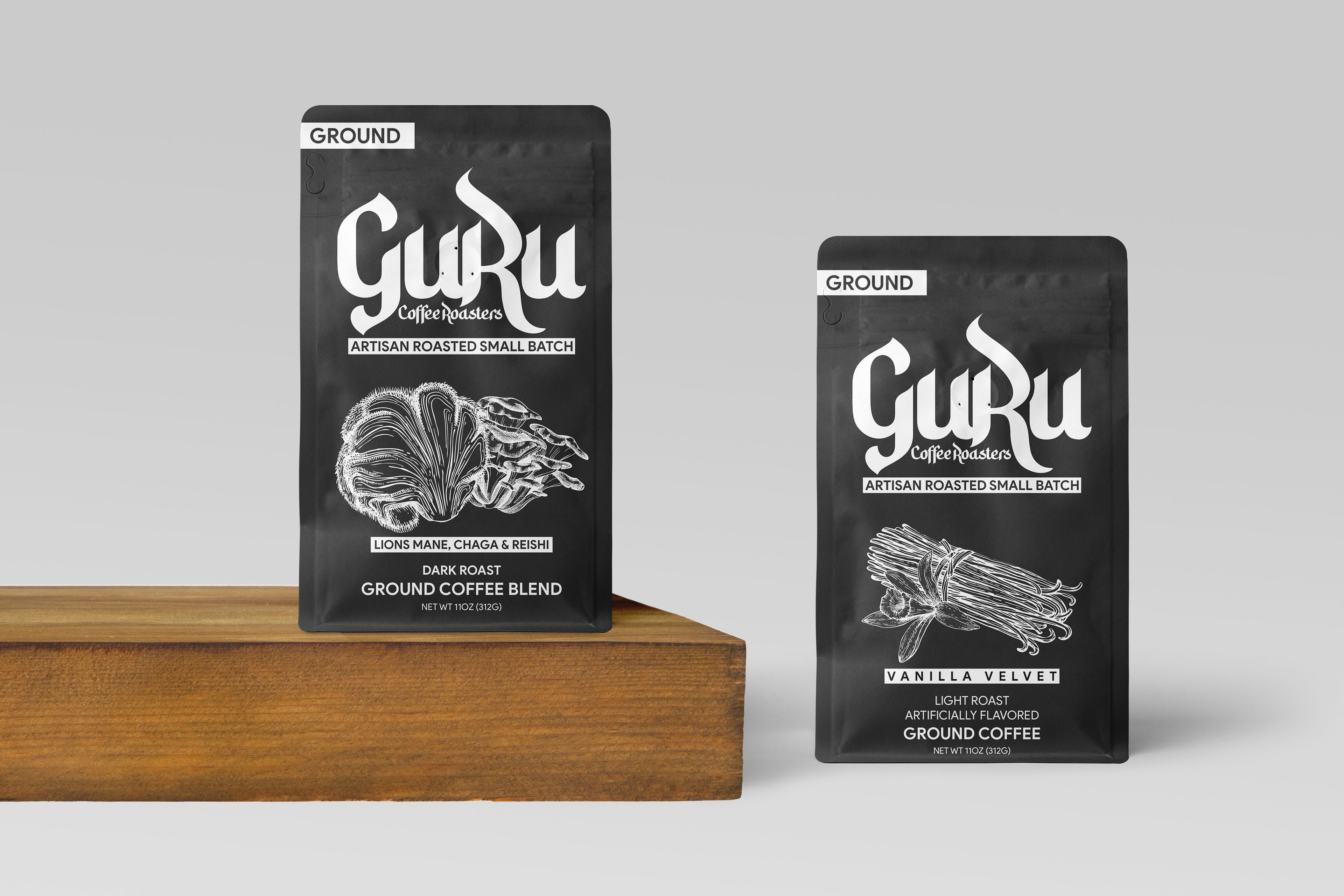
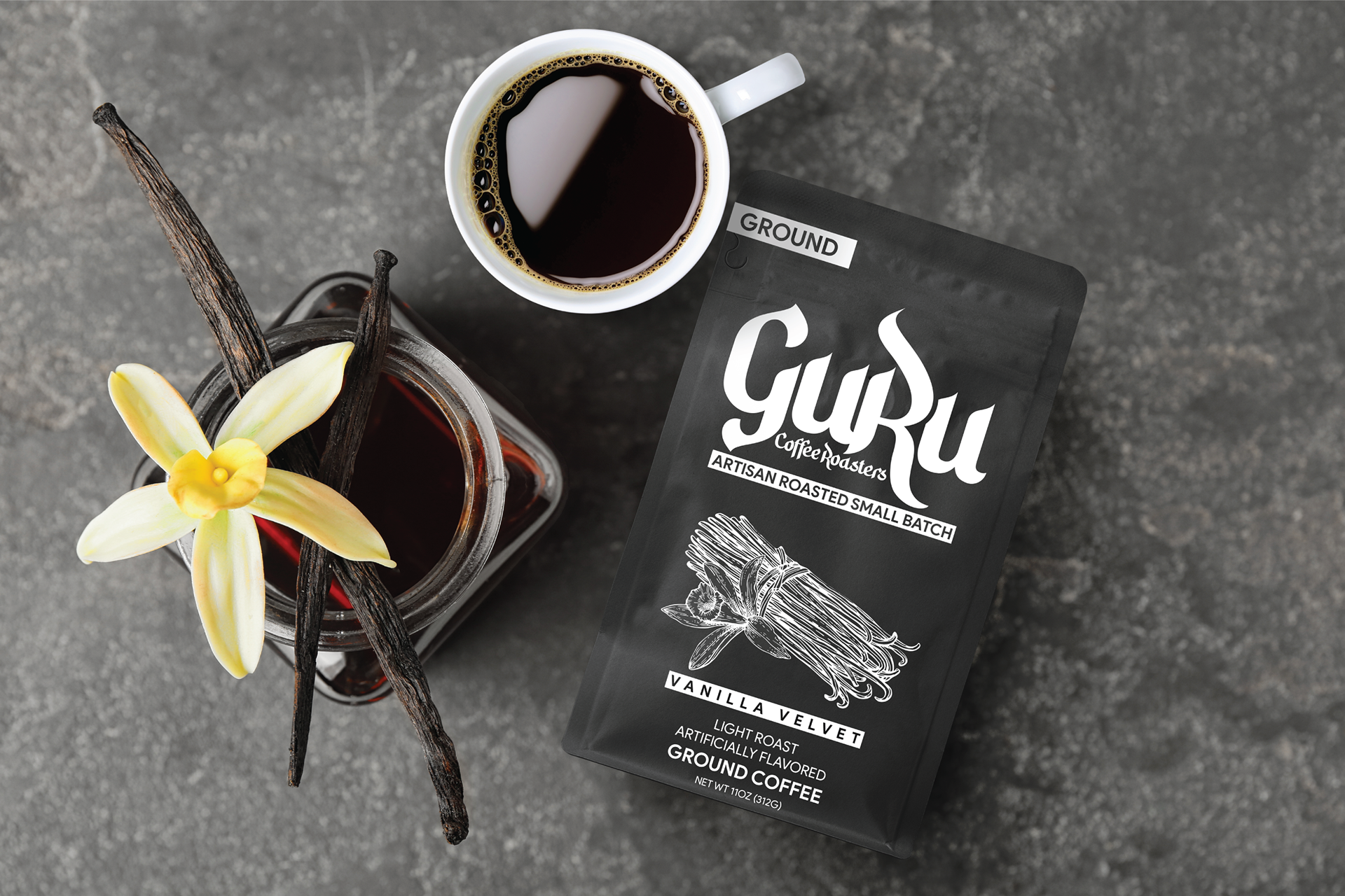
So I took it upon myself to offer a rebrand. Guru's current brand has an image of an "Asian Farmer" as the main identity piece. I tried to incorporate different visual logo ideas that were in the same vein as that logo, but they all ended up looking cheesy and ultimately like clipart, and the absolute last thing you want is for your brand to look like a bad cartoon. So instead of incorporating a logomark, I decided to stick solely to a wordmark instead. Guru's current wordmark is a mixture of blackletter typefaces and Hindu typefaces. The problem with this is that because the tails of the G and R are so long, it's hard to place the other subtext identifiers under the main wordmark without there being a massive space between the two.
This is a bad thing because it creates competition between the main wordmark and the subtext making it difficult for your eye to know what to look at first. To correct this issue, I decided to make the two u's lowercase to allow for some room between the G and the R to place the subtext comfortably. Instead of using the same font, I created a modified version of Hidayatullah DEMO, a middle eastern style font as the main wordmark and also as the subtext or supporting wordmark.
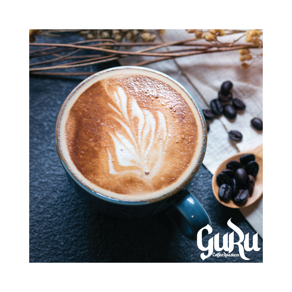
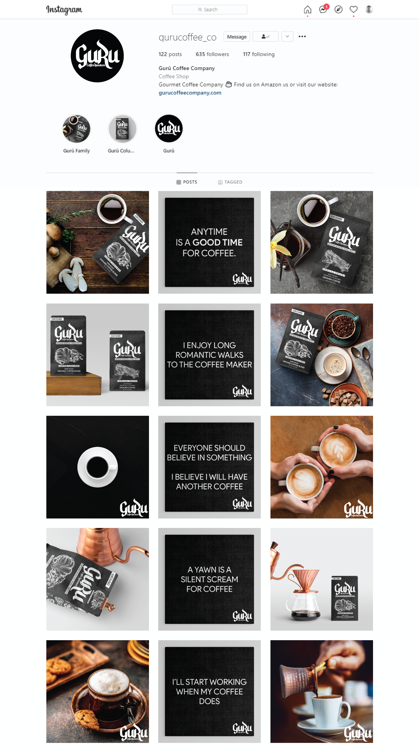
What resulted are the following logo designs and packaging.
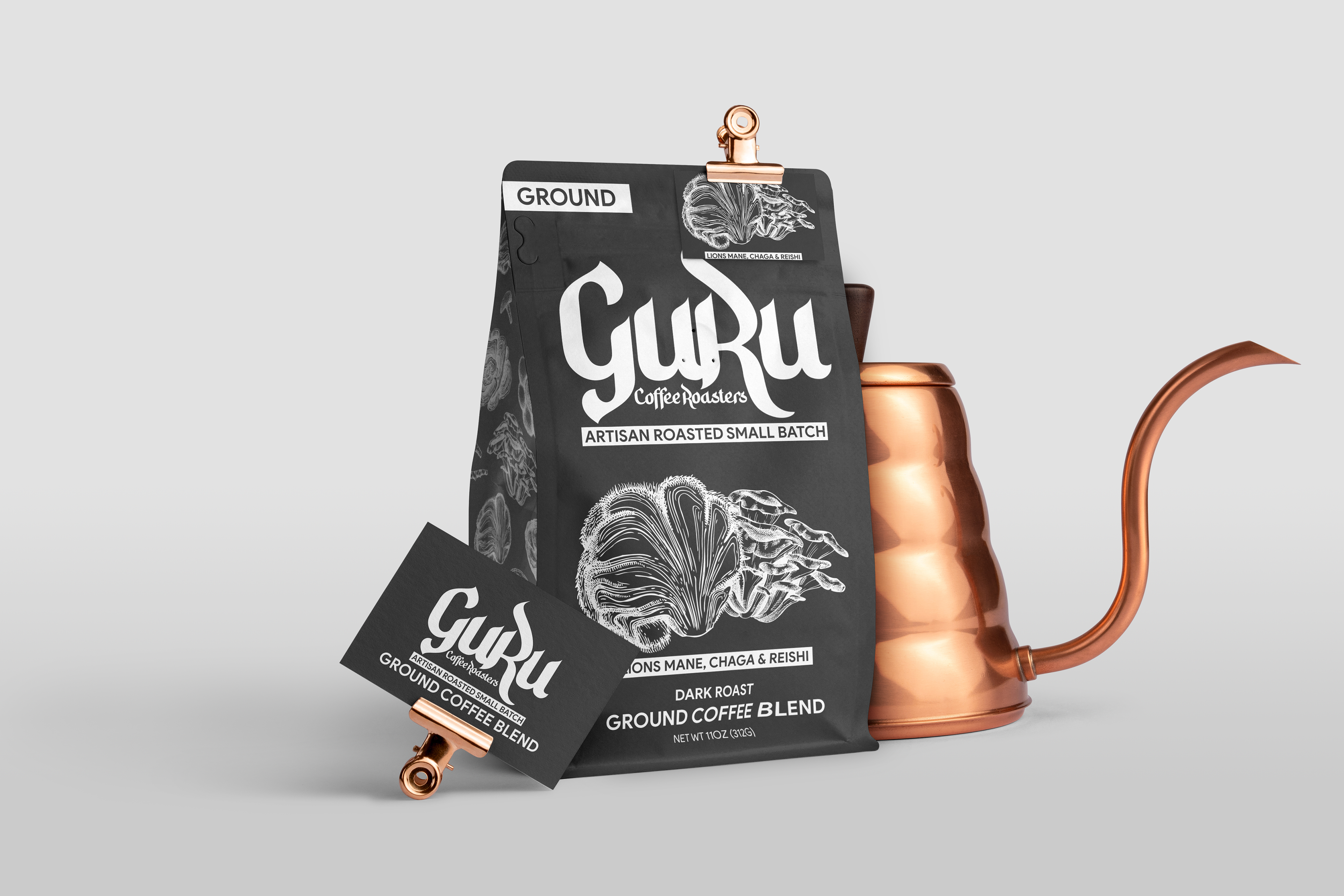
Instead of using a bunch of colors and gradients like Guru uses in their current brand, I wanted to go with a more muted "chalkboard" look with contrasted blacks and whites and hand drawn illustrations. Similar to Koffee Kult's packaging.