THE MISSION
In 2018, we approached Beachbreak Beans with a simple mission - “Let us make your brand identity a more cohesive brand for you and your customers”
In 2018, we approached Beachbreak Beans with a simple mission - “Let us make your brand identity a more cohesive brand for you and your customers”
THE OUTCOME
Since their brand was relatively small and still in it’s growing stages, we felt we had a good opportunity to improve the visual presence without disturbing their market.
Since their brand was relatively small and still in it’s growing stages, we felt we had a good opportunity to improve the visual presence without disturbing their market.
THE IMPACT
In order to increase brand loyalty, we wanted to create an identity that had a timeless feel to it, while remaining fun and engaging without alienating consumers from all demographics. By rebranding Beachbreak Beans core identity, we improved their visual aesthetic presence which resulted in a more organic approach to branding. This increased engagement across their social media profiles and website while decreasing bounce rates and increasing customer conversion rates.
In order to increase brand loyalty, we wanted to create an identity that had a timeless feel to it, while remaining fun and engaging without alienating consumers from all demographics. By rebranding Beachbreak Beans core identity, we improved their visual aesthetic presence which resulted in a more organic approach to branding. This increased engagement across their social media profiles and website while decreasing bounce rates and increasing customer conversion rates.
THE SERVICES OFFERED:
•Brand Strategy •Brand Messaging & Positioning •Logo Design •Style Guides •Illustration & Iconography •Social Media Strategy
•Brand Strategy •Brand Messaging & Positioning •Logo Design •Style Guides •Illustration & Iconography •Social Media Strategy
THE STORY
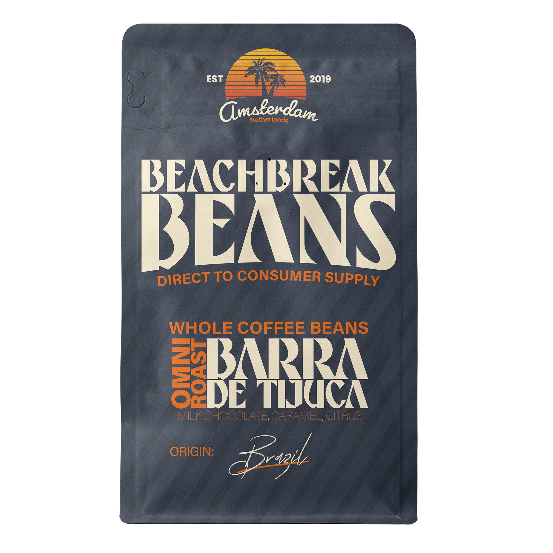
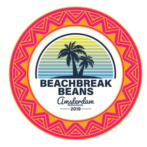
Beach Break Beans is a coffee roaster that started production in 2018 in Amsterdam, NE. Their goal was simple, to create a coffee that “you brew after you just had a good surf on a sunny day.” And while that seems simple enough, the reality of starting a successful coffee company is hard enough without having to worry about solid branding and messaging. The founder Rutger says -“Taking a sip of filter coffee and talking about flavor notes like bergamot or fermented papaya can be fun for specialty coffee roasters but let’s be honest: the only thing you want to taste is really good coffee and good vibes.”- Therein lies the color scheme. We adopted colors that we would later call Juicy Mango, Dried Papaya, and Bergamot Citrus. So we got hard to work at creating an identity system that adhered to Rutgers's desire for a brand with “good vibes” while also remaining approachable and easily identifiable.
We started off by researching what small-batch coffee roasters there were in Amsterdam and what their aesthetic was. We noticed right off the bat that while there were a good number of coffee roasters in Amsterdam, especially in the same area as Beachbreak Beans. One thing that they were all missing though was that "je ne sais quoi" that really embodied the soul of the surfer.
The next step was to do a few user surveys to see what the community thought about a coffee roaster that wanted to focus more on the quality and flavor of the coffee and less on what special way it was roasted. After asking them this, we asked them what they thought this coffee brand would look like. It would be an understatement to say that the responses varied so much in a way that it was hard to draw any conclusion. With what information we had, we moved to the next stage of prototyping the brand identity.

FROM THE
OLD TO THE NEW
OLD TO THE NEW
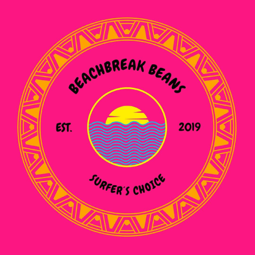
The images above show the original logo that Beachbreak Beans had to start with and it definitely needed work. We wanted to create something that was similar but unique in its own way. Our first logo shown center left was an attempt to
solve that problem.
solve that problem.
While it did remain similar in styling we wanted to give it more of an 80’s flair with the gradient blinds effect being in the background of the palm tree instead of being the waves. Both of these attempts were obviously terrible. So what do you do when you have something that is terrible? Well you make it more terrible of course. So we introduced the third rendition of the logo.


CREATING AN IDENTITY WITH "GOOD VIBES"
In the 4th sketch, the “tribal ring” was obviously not working so we did away with completely and kept only the palm tree and sunset portion of the logo. We removed the border on the sunset and changed the color palette to depict a setting sun versus a rising sun and added Amsterdam Netherlands in a cursive font below the setting sun. This iteration while good was still missing something.
During this time I had starting working more on the typography of the logo and set the icon portion of the logo to the side to readdress at a later date. We wanted to create a font that had a “70’s bell-bottom jean” to it with a more blocky feel as to appeal to the surfer / skater audience as well.
What resulted was a typeface I developed called Aveline. We decided to use this as our display typeface. The 5th and final rendition incorporated all of the aspects of the previous renditions, but with that timeless look that is now BeachBreak Beans.
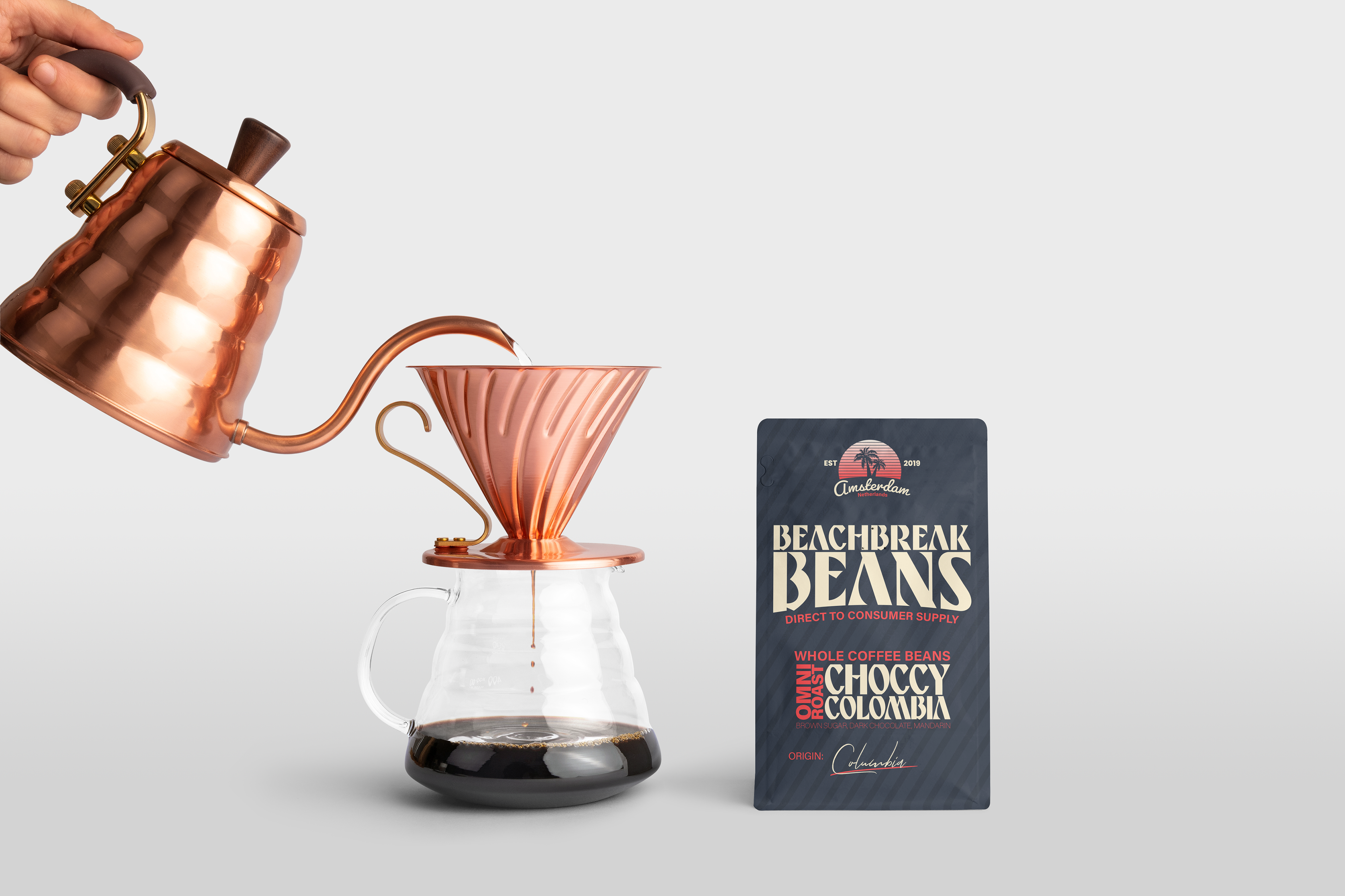
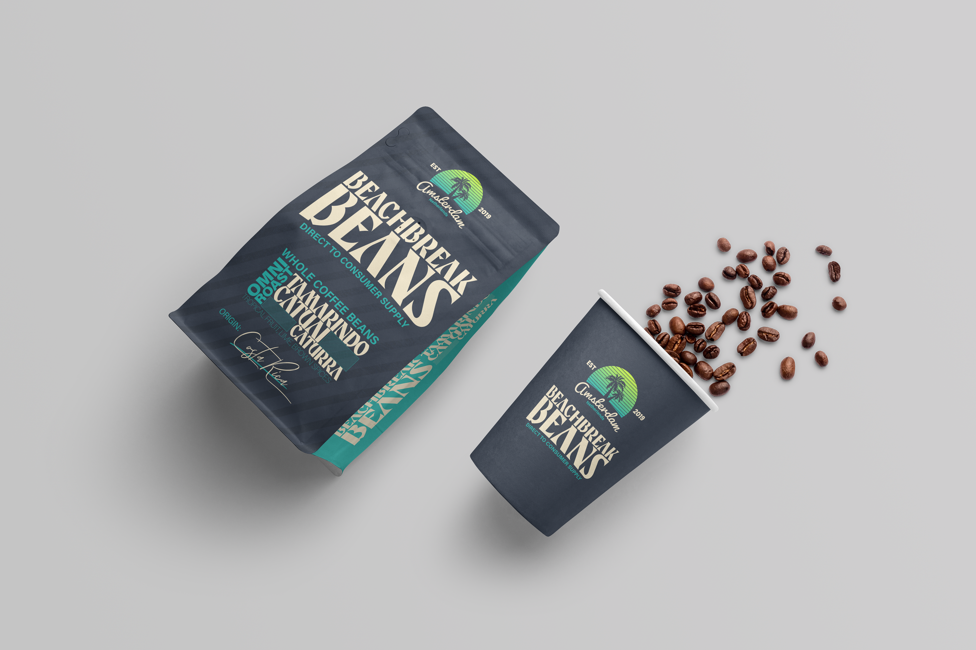
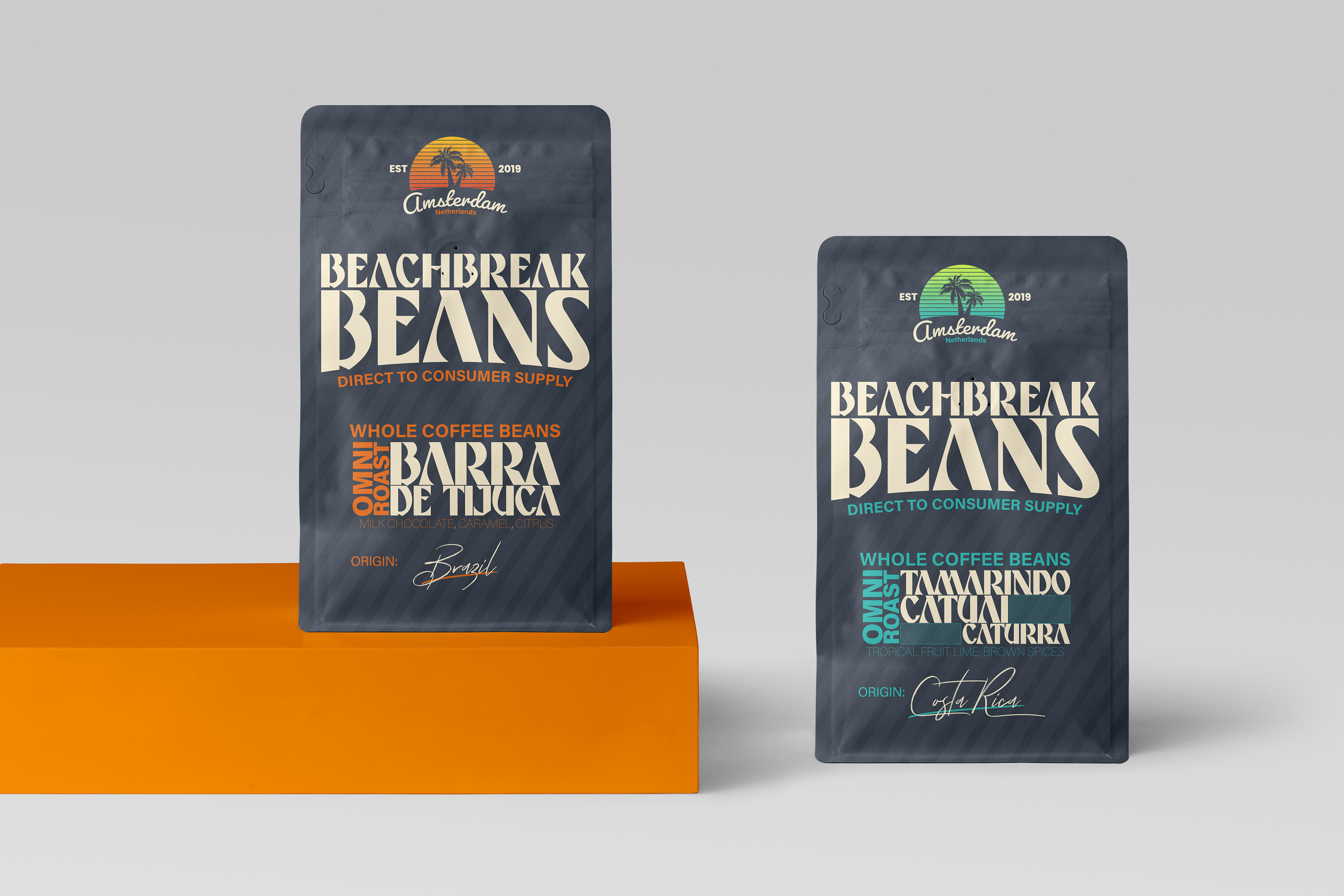
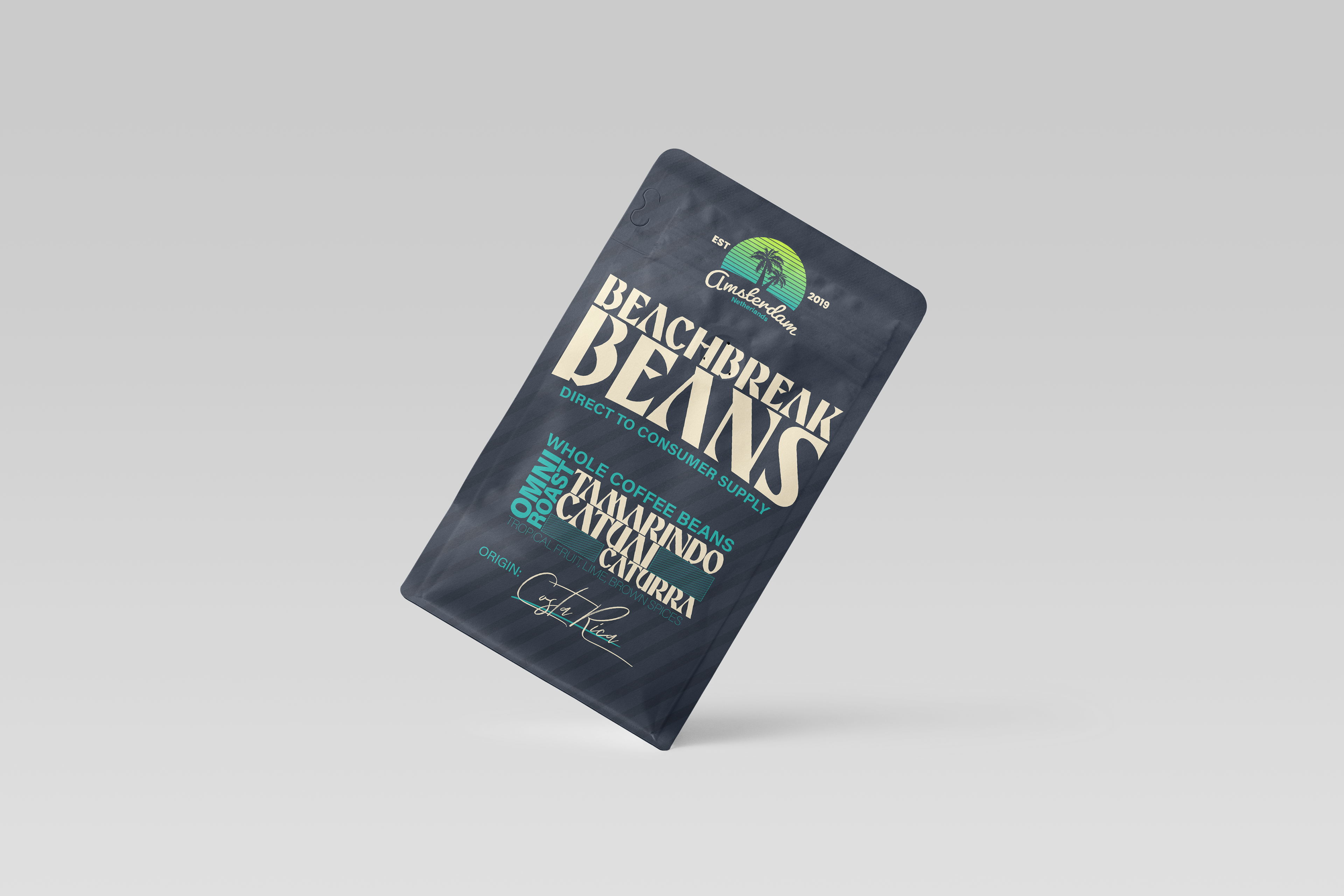
THE VISUALS

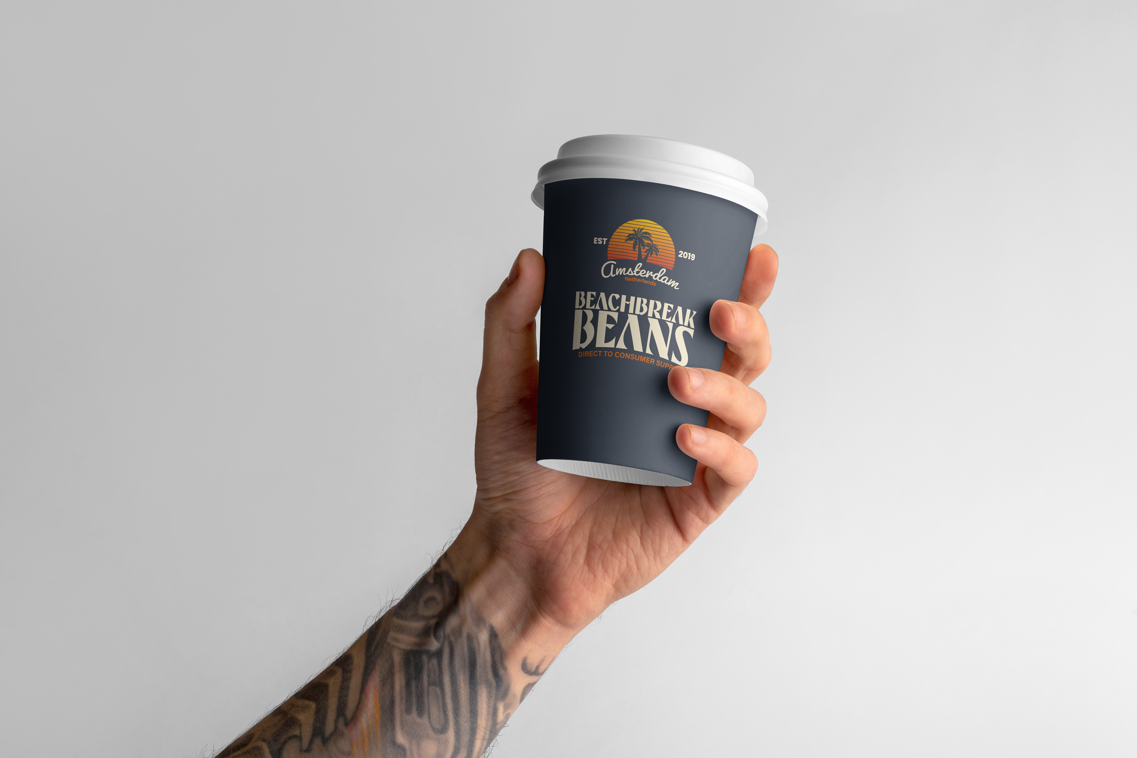
With smart photography and clean mockups, we wanted to display the new coffee packaging and labels in the most natural way possible. Incorporating warm wood tones and brass and copper element allowed us to tie in the warm earth tones of the color palette while keeping the color highlights clean and attractive.


IF YOU LIKE THIS SERIES AND WANT TO SEE HOW YOUR BRAND COULD BE BROUGHT TO LIFE, CONTACT US AT DESIGN@DOMORE.TV OR HEAD TO HTTPS://DOMORE.TV